Custom Color Acetate Frames: How to Design Your Brand's Signature Look
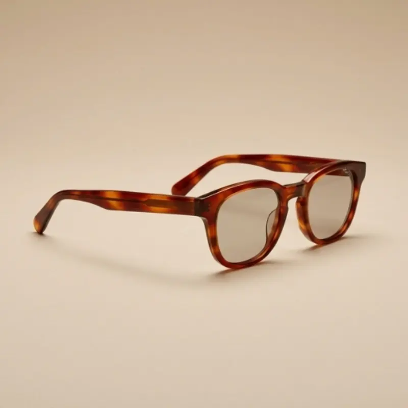
Most brands approach acetate color one style at a time. A new season comes, a new colorway gets picked, and the decision resets from scratch. What gets lost in that process is the thing color is actually capable of doing for a brand: building recognition that compounds season after season, rather than starting over every time.
A signature color — or a coherent color system — is one of the few design decisions a brand can make once and benefit from for years. This guide is about that decision: how to think about color as a brand asset, not just a per-style choice, and how that thinking should shape what you order from your manufacturer. For the technical side of getting a specific color made correctly — sheet selection, briefing, lead times — see our companion guide on custom color acetate sunglasses, which covers that process in depth.
Why Acetate Color Can Become a Brand Asset
Acetate’s color sits inside the material, not on top of it. A tortoiseshell or solid-color acetate frame holds its color through the full thickness of the sheet, which is part of why acetate color reads as richer and more permanent than dyed or surface-printed plastics. That physical property is what makes acetate color capable of functioning as a recognizable signature in a way painted or molded color generally can’t match.
Recognition built through consistent color works the same way it does for a logo or a typeface — it depends on repetition, not on any single product being color-perfect. A customer who’s seen your specific amber-and-black tortoiseshell across three seasons of styles starts to recognize the brand from the color alone, before they register the frame shape. That recognition is the actual commercial value of a signature color, and it only builds if the color shows up consistently rather than changing with every collection.
This is different from picking a color you like for one style. A signature color is a decision you’re committing to across multiple seasons, multiple frame shapes, and — eventually — enough product that customers start to associate that specific shade with your brand before they associate anything else.
Signature Color vs. Seasonal Color: Two Different Jobs
Not every color in your collection should be doing the same work. Treating every colorway as equally important — or worse, replacing your whole palette every season — makes it harder for any single color to build recognition.
A signature color is the one that stays. It appears across multiple frame shapes, carries through multiple seasons with minimal change, and becomes the color a customer associates with the brand specifically — independent of any one style. This is usually one color, or a tightly related family of two or three.
Seasonal colors are the ones that rotate. They let a collection feel fresh, respond to trend cycles, and give returning customers a reason to look at the new drop — without disturbing the core identity the signature color is building.
The brands that get the most value from color are deliberate about which role each colorway is playing. A collection where every color is “seasonal” never builds the compounding recognition a true signature color delivers. A collection where every color is treated as “signature” loses the trend responsiveness that keeps a collection feeling current.
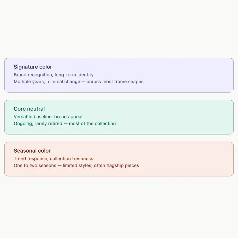
| Color Role | Purpose | Typical Lifespan | Frame Coverage |
|---|---|---|---|
| Signature color | Brand recognition, long-term identity | Multiple years, minimal change | Across most or all frame shapes |
| Core neutral | Versatile baseline, broad appeal | Ongoing, rarely retired | Most of the collection |
| Seasonal color | Trend response, collection freshness | One to two seasons | Limited styles, often flagship pieces |
Building a Color System, Not a One-Off Choice
A color system is a small, deliberate set of colors that work together across a collection — rather than each style being color-matched in isolation. Most established eyewear brands work from a structure close to this:
One signature color — the anchor color, present across the widest range of styles and the longest timeframe.
Two to three core neutrals — black, crystal, classic tortoiseshell, or similar versatile options that provide broad appeal and pair naturally with the signature color in marketing and lookbook contexts.
A rotating seasonal set — typically two to four colors per season, used on a subset of styles to keep the collection feeling current without diluting the core identity.
Building from a system rather than choosing colors style-by-style has a practical production benefit too: it concentrates your colorway commitments instead of spreading them thin. A brand ordering the same signature color across five frame shapes is working with one well-understood sheet order across multiple styles, rather than five separate, smaller color decisions — which tends to be easier to manage on lead time and consistency than a fully independent palette per style.
How Color Choice Reads Differently Across Frame Shapes
The same acetate color doesn’t carry identical brand meaning across every frame shape, which matters when you’re deciding where your signature color should appear first and most often.
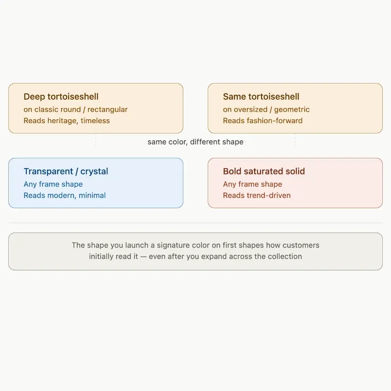
A deep tortoiseshell on a classic round or rectangular frame reads as heritage and timelessness — the color and silhouette are both signaling “established,” which is part of why this combination dominates premium fashion eyewear. The same tortoiseshell on an oversized or geometric shape reads more fashion-forward, since the unconventional silhouette pulls the overall impression toward trend-driven rather than classic.
Transparent and crystal-effect acetates tend to read as modern and minimal regardless of frame shape, since the visual lightness of the material itself carries that signal more than the silhouette does. Bold solid colors — a saturated red, a deep emerald — read as the most fashion-forward and trend-driven option in nearly any shape, which makes them well suited to seasonal use but a riskier choice as a long-term signature color for a brand aiming at broad, lasting appeal.
This is worth thinking through before locking in a signature color: the shape you launch it on first will shape how customers initially read that color, even after you expand it across the rest of the collection.
Matching Color Direction to Market and Customer
Color preference varies meaningfully across markets and customer segments, and a signature color chosen without that context can underperform even when the color itself is well executed.
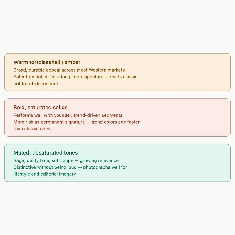
Warm tortoiseshell and amber tones have broad, durable appeal across most Western markets and tend to be a safer foundation for a long-term signature color, precisely because they read as classic rather than trend-dependent. Bold, saturated solids perform well with younger, trend-driven customer segments but carry more risk as a permanent signature, since trend-aligned colors have a shorter natural lifespan before they start to feel dated. Muted, desaturated tones — sage, dusty blue, soft taupe — have grown in relevance with customers who want a distinctive color without it reading as loud, and they tend to photograph well across the lifestyle and editorial imagery most DTC eyewear brands rely on.
None of this is a fixed rule — a brand built specifically around bold, trend-forward identity may correctly choose a saturated seasonal-feeling color as its signature, because that volatility is part of the brand’s positioning. The point is that the choice should be made with the target customer in mind, not selected purely on what looks good as a single frame on a desk.
What This Means for Your Production Plan
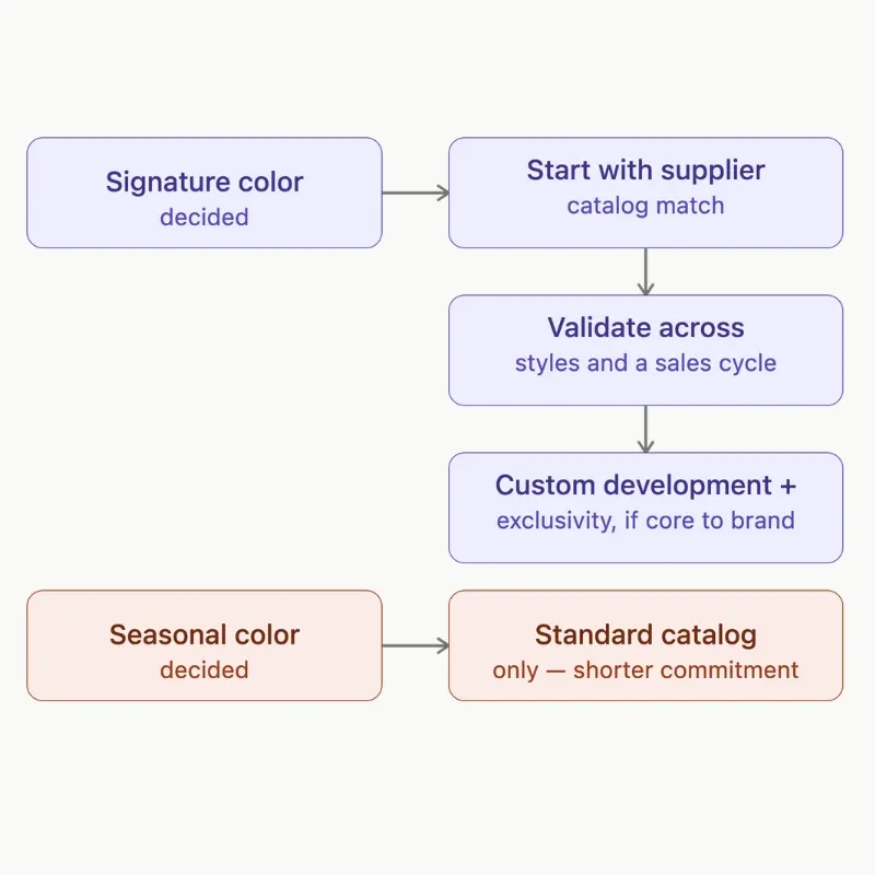
Once you’ve decided which color is doing signature work and which are seasonal, that decision should shape your sourcing conversation, not just your design moodboard.
A signature color is worth the additional investment of starting from a standard acetate sheet supplier’s catalog match if at all possible, rather than committing to custom color development immediately — this keeps your first production run faster and lower-risk while you confirm the color performs the way you expect across multiple styles and a real sales cycle. If, after that, the color is core to your identity and you want it locked to your brand specifically, custom development and an exclusivity arrangement become a reasonable next investment — our guide to custom color acetate sunglasses covers exactly how that process works, including lead times and minimums for custom-developed colors.
Seasonal colors, by contrast, are usually better served by standard catalog options precisely because you don’t want to carry the longer lead time or higher minimum of a custom development cycle for a color you’re only committing to for one or two seasons.
The Practical Takeaway
A signature color is a brand decision before it’s a production decision — it only pays off if it’s chosen with the patience to repeat it across seasons rather than treated as one more colorway choice. Separating signature color from seasonal color, building a small deliberate system instead of an unrelated palette, and matching your color direction to your actual customer are the parts of this that happen before you ever brief a manufacturer. The technical execution — getting the specific shade right, understanding lead times, deciding between catalog and custom development — is a separate, equally important conversation, covered in detail in our guide to custom color acetate sunglasses, worth working through before you brief a manufacturer on your next acetate sunglasses collection.
Frequently Asked Questions
How many colors should a new eyewear brand launch with?
Most brands launching their first collection do well with one signature color, one or two core neutrals, and a small seasonal set of two to three additional colors — enough to show range without diluting which color customers associate with the brand. Expanding the seasonal set is easier once the signature color is established than retroactively building recognition for a color introduced later.
Can a brand have more than one signature color?
It’s possible but harder to execute well. Two signature colors split the recognition-building effort and generally take longer to become identifiable than committing to one. Brands that do run with two signature colors usually have a clear logic for the split — a men’s and women’s line, or two genuinely distinct sub-collections — rather than simply liking two colors equally.
Should a signature color ever change?
Rarely, and not without a clear reason. The value of a signature color comes from consistency over years, so changing it resets the recognition you’ve built. A brand repositioning entirely, or one whose signature color turns out to have limited market appeal after a season or two of real sales data, are the more legitimate reasons to revisit it — not simply wanting something new for the next collection.
Is a custom-developed color always better than a catalog color for a signature shade?
Not necessarily. A standard catalog color can absolutely function as a signature color — recognition comes from consistent use, not from the color being exclusive. Custom development becomes worth the additional cost and lead time when exclusivity itself matters to the brand, or when no catalog option gets close enough to the specific shade the brand has in mind.
How does color strategy affect MOQ planning?
A signature color used across multiple frame shapes lets you concentrate volume into fewer, larger colorway orders rather than spreading minimums thin across many one-off seasonal colors. This generally makes it easier to work efficiently within standard acetate MOQ structures — typically 300 pieces per style and 100 pieces per colorway — since your signature color volume compounds across styles rather than resetting with each one.
Does frame shape limit which colors work as a brand’s signature?
Not strictly, but shape affects how a color reads, which is worth factoring into the decision. A heritage-leaning color like deep tortoiseshell tends to reinforce a classic, timeless brand position most clearly on traditional silhouettes, while the same color on a bold geometric shape shifts the overall impression toward fashion-forward. Neither is wrong — the combination should match the brand identity you’re building, not just the color in isolation.
Let's get started!
Get in touch with a custom eyewear specialist now for a free consultation and instant price quote.
WHATSAPP ME GO!
📱 Scan with your phone to start chatting