Reading Glasses Private Label Packaging: Logo, Case, and Display Options
Packaging for reading glasses isn’t one decision — it’s three, depending on where the product is actually going to sell. A pharmacy shelf, a corporate gift program, and a DTC fashion brand each need a completely different packaging logic, and applying the wrong one is one of the more common ways first-time buyers waste budget on packaging that doesn’t fit its channel.
This guide walks through what each channel actually needs, then goes deeper on the fashion-brand side — where packaging does the most work in shaping how a product is perceived.
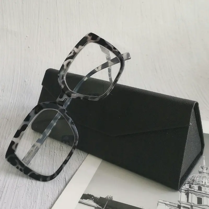
Pharmacy and Retail Channel: Function First, Branding Second
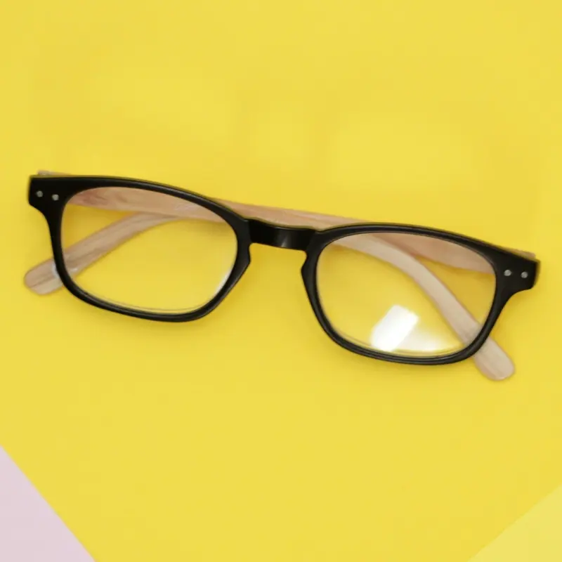
Pharmacy, supermarket, and convenience-channel reading glasses are impulse purchases, and the packaging has to support a fast, low-friction buying decision rather than a considered one.
- Clear power labeling is non-negotiable. Diopter strength needs to be readable at a glance — usually via color-coded stickers or printed labels — since customers are selecting their own strength without assistance.
- Barcode and retailer-portal compliance matters more than design. Many pharmacy and chain retail buyers require specific barcode placement and formatting to move through their systems without manual handling.
- Packaging should be minimal and durable, not elaborate. A simple blister pack or polybag with a printed card is standard — the goal is shelf visibility and protection during handling, not an unboxing experience.
- Counter and floor displays are part of the package, not separate. Pre-kitted displays with strength-coded sections make restocking fast for store staff, which matters more to this channel than premium presentation.
For this channel, spending on hard cases or premium pouches is usually wasted — the customer isn’t paying for a package experience, they’re grabbing a practical solution.
Gift and Promotional Channel: Presentable, Portable, Complete-Feeling
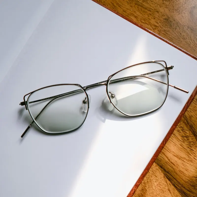
Gift and promotional reading glasses — corporate gifts, conference giveaways, wellness program items — have a different job: the product needs to feel complete and thoughtful the moment it’s handed over, since there’s no retail shelf moment to build anticipation.
- Folding or compact styles pair naturally with branded cases. A folding reader that closes into its own hard case reads as a “real gift” rather than a throwaway item, which matters when the recipient is judging the giver’s intent.
- Logo placement often goes on both the case and the frame. A single-color imprint on a temple, paired with a matching logo on the case exterior, reinforces branding without needing full-color printing.
- Compact outer packaging matters for bulk handling. Gift program buyers are often distributing hundreds or thousands of units at once — packaging that stacks and ships efficiently in bulk is as important as how the individual unit looks.
- A cleaning cloth or small card adds perceived value cheaply. These are low-cost additions that make a gift-channel reader feel more considered without meaningfully raising unit cost.
This channel sits between pharmacy-level minimalism and full brand-experience packaging — presentable enough to feel like a genuine gift, without the cost structure of a premium DTC unboxing.
Fashion and DTC Brand Channel: Packaging as Brand Extension
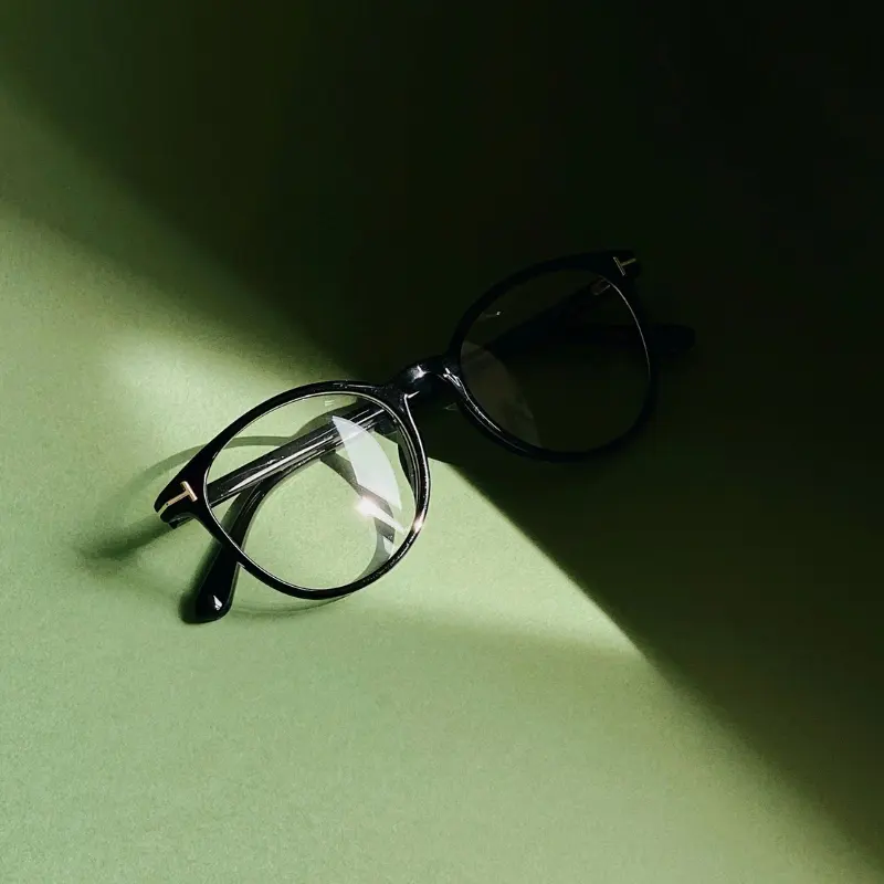
This is where packaging carries the most weight, because a fashion brand’s reading glasses are competing for the same perception as the rest of its catalog — not against other reading glasses, but against the brand’s own sunglasses or optical line sitting next to it.
Logo Techniques That Match the Frame Material
Logo execution should follow the same material logic covered in our frame materials guide:
- On acetate frames, an inlay badge or subtle engraving on the temple reads as premium and holds up well against the material’s natural texture.
- On TR90 frames, pad printing on the inside temple is the practical standard — clean, durable, and appropriate for a volume-oriented material.
- On metal accents, laser engraving gives the cleanest, most permanent result and suits the smaller, detail-oriented role metal typically plays in a reading glasses line.
Case and Pouch Options by Positioning
| Packaging Tier | Typical Format | Best Fit |
|---|---|---|
| Entry | Branded soft pouch, printed card | First launch, budget-conscious fashion lines |
| Mid | Semi-hard case with foil-stamped logo | Established styles, reorders |
| Premium | Hard case matching sunglasses/optical packaging | Flagship styles, boutique or DTC flagship channel |
Starting at the entry tier and upgrading at reorder — rather than committing to premium packaging on an unproven first style — keeps early risk lower while still leaving room to elevate presentation once a style proves itself.
The Unboxing Moment Matters More for DTC
Unlike pharmacy readers, a DTC customer typically doesn’t see the product in person before it arrives. That makes the box, tissue, and first-open experience part of the product itself — consistent with a brand’s sunglasses or optical packaging tells the customer this reader is a real part of the collection, not an afterthought add-on.
A Quick Comparison Across Channels
| Pharmacy / Retail | Gift / Promotional | Fashion / DTC | |
|---|---|---|---|
| Primary goal | Fast, clear purchase decision | Feel complete and thoughtful | Reinforce brand identity |
| Typical packaging | Blister pack, polybag, printed card | Branded case, cleaning cloth | Soft pouch to premium hard case |
| Logo emphasis | Minimal, functional labeling | Case + frame, single color | Material-matched, brand-consistent |
| Display need | Counter/floor display, power-coded | Bulk-efficient outer packaging | Retail or online unboxing experience |
Don’t Forget: Packaging Has Its Own MOQ
Regardless of channel, custom packaging typically carries a separate minimum order quantity from the frame itself — often starting in the low hundreds to low thousands depending on print complexity. This is covered in more detail in our MOQ and packaging guide, but it’s worth repeating here: confirm packaging MOQ before finalizing frame quantities, not after.
Frequently Asked Questions
What packaging is standard for pharmacy-channel reading glasses?
A simple blister pack or polybag with a printed power label and barcode is standard. Elaborate cases or premium pouches are rarely worth the added cost in this channel, since the purchase decision is fast and price-driven.
What logo technique works best for a fashion-forward acetate reader?
An inlay badge or subtle laser engraving on the temple tends to look most premium on acetate and holds up well against the material’s natural texture, compared to printed logos.
Should a first-time fashion brand start with premium packaging?
Usually not. Starting with an entry-tier soft pouch and printed card, then upgrading to a semi-hard or hard case at reorder once a style proves itself, keeps early risk lower.
Is gift-channel packaging the same as retail packaging?
No. Gift and promotional packaging needs to feel complete and presentable at the moment of handover, while retail/pharmacy packaging prioritizes shelf visibility and fast restocking over presentation.
Which packaging tier and logo technique fit a specific line comes down to channel and material more than personal preference — worth mapping out on the production side alongside your frame order.
Let's get started!
Get in touch with a custom eyewear specialist now for a free consultation and instant price quote.
WHATSAPP ME GO!
📱 Scan with your phone to start chatting