From Moodboard to Design Brief: How Eyewear Manufacturers Actually Use What You Send
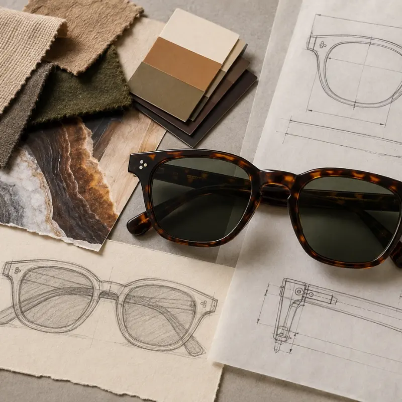
A lot of first conversations with a new brand start the same way: no tech pack, no measurements, just a moodboard — a folder of reference images, a color palette, maybe a few competitor styles pinned next to some fabric swatches and a mood word or two. If that’s what you’ve got, it’s worth knowing it’s not a weak starting point. It’s actually the normal one. The more useful question isn’t “is this enough,” it’s “what happens to it after I send it.”
What a Moodboard Actually Communicates Well
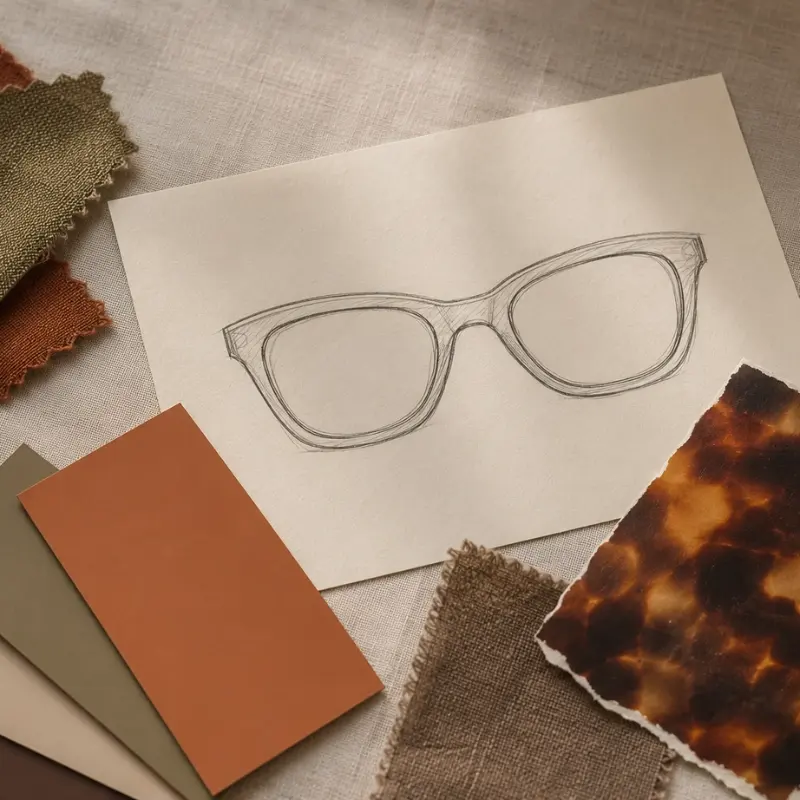
A moodboard is genuinely good at a specific set of things: overall tone (minimal vs. bold, vintage vs. futuristic), a color direction, a sense of material texture, and how a brand wants to feel next to its other products. That’s real information, and it’s often more useful than a rigid spec sheet for getting a design direction right early.
What it doesn’t communicate — and isn’t meant to — is anything about manufacturability: exact dimensions, hinge mechanism, how a color reads once it’s actually cut from acetate sheet instead of shown on a screen, or whether a silhouette that looks clean in a reference photo is structurally realistic at scale. That gap is normal. It’s also exactly the part a design and engineering team is there to fill in.
What Actually Happens to a Moodboard on Our End
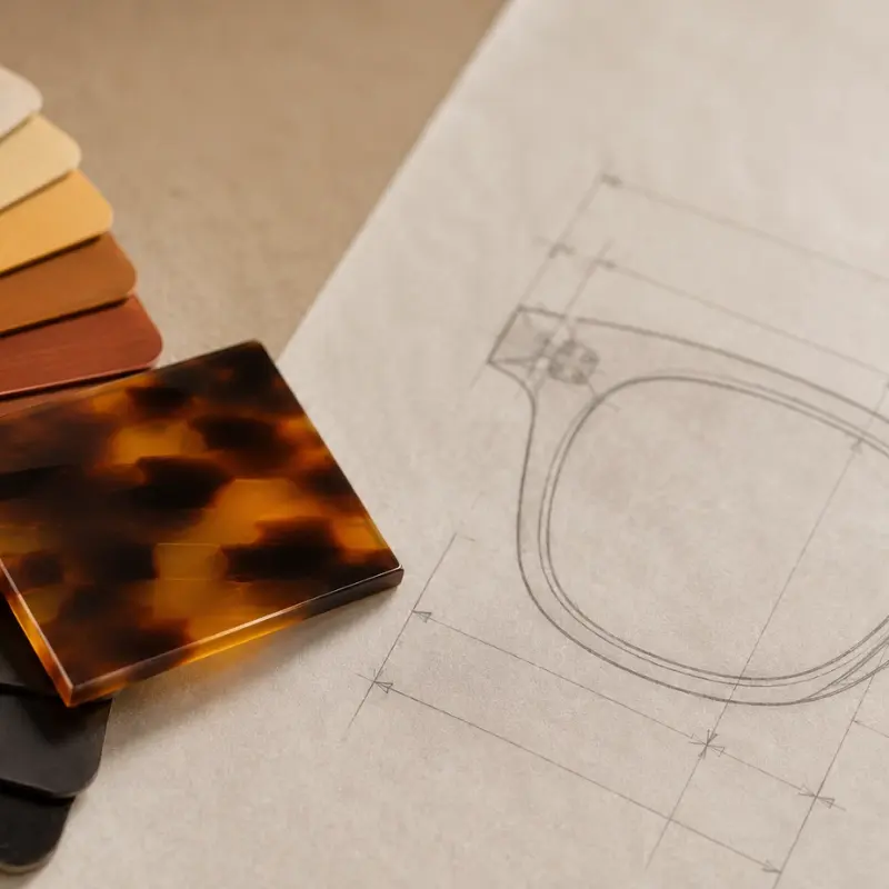
The translation from images to a manufacturable design isn’t one step, it’s a few:
Pulling out concrete parameters. A color palette gets matched against Pantone references and real acetate or metal finish options — not just “this looks like that shade,” but confirming which actual sheet or plating option gets closest to it. Silhouette cues (square, round, cat eye, oversized) get mapped to a base frame category, even if what’s referenced is a mix of several different styles.
Reading material and hardware cues. A moodboard with a lot of tortoiseshell or marbled texture points toward acetate; clean, minimal, hardware-forward references usually point toward metal or a metal-acetate combination. Logo and hardware references (a buckle finish, a zipper pull, a specific screw detail) get noted as branding cues, even when they’re not eyewear images at all.
Drafting and checking back against the original. Once a 2D or 3D drawing exists, it gets compared against the moodboard directly — not just “does this match the spec,” but “does this still feel like the board.” This step is where a lot of the actual design judgment happens, and it’s worth being an active participant in rather than just waiting for a result.
Where Design Intent Usually Gets Lost — and How to Guard Against It
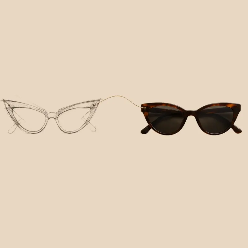
This is the part that goes wrong more often than people expect: a moodboard is right, the sketches feel personal, the first conversations sound promising — and then the sample arrives feeling slightly generic. Nothing is obviously wrong. The proportions aren’t wildly different. It just doesn’t feel as specific to the brand anymore.
This usually happens gradually, across several small decisions rather than one big one — a slightly more standard hinge because it’s faster to source, a color that’s close-but-not-exact because it was easier to match, a shape rounded off slightly because it’s a more familiar mold. Each individual choice seems minor. The cumulative effect is a frame that’s technically close to the brief but has lost its specificity.
A few things reduce this risk:
- Keep the original moodboard visibly in the loop, not just at the brief stage. Referencing it again at the drawing stage and the sample stage — not only at kickoff — catches drift before it compounds.
- Flag trade-offs as they come up, not after. If a referenced hinge detail isn’t practical at the target price point, that’s worth a conversation at the drawing stage, not a silent substitution discovered in the sample box.
- Ask for reasoning, not just results. If a drawing interprets a moodboard in a specific way, understanding why helps you catch early if the interpretation is heading somewhere you didn’t intend.
What’s Still Needed Beyond the Moodboard
A moodboard gets a project started, but a few things eventually need to be pinned down that no visual reference communicates on its own: target retail price (which affects material and finishing decisions), rough quantity expectations, target market (for compliance and sizing conventions), and any specific brand assets like an existing logo file. None of this needs to be ready on day one — our guide on writing a brief that gets a real response covers what’s useful to have ready and when, if you want to see the fuller picture beyond the visual direction.
What If My Moodboard Has No Eyewear in It at All?
This comes up more than you’d think, and it’s not a problem. A moodboard built from interiors, packaging, fabric, or general brand imagery — with no sunglasses or frames in it — still communicates color, materiality, and tone, which is most of what’s actually useful at this stage. The frame-specific translation (which silhouette, which hardware, which construction) is a conversation to have on top of that, not something the moodboard needed to solve on its own.
FAQ
Do I need a moodboard before reaching out, or can I send references some other way?
A moodboard helps, but it’s not a requirement. Scattered reference images, a couple of competitor products you like, or even just a few sentences describing the direction all work as a starting point. The goal is communicating intent, and there’s more than one way to do that.
How specific does my moodboard need to be about eyewear?
Not very. A moodboard heavy on general brand tone, color, and material — with little or no eyewear-specific imagery — is common and workable. The eyewear-specific decisions get made collaboratively once development starts.
What happens if the first drawing doesn’t match what I had in mind?
That’s what the revision stage is for. A first drawing is a translation, not a final answer, and comparing it against the original moodboard is exactly how gaps get caught and corrected before anything moves to physical sampling.
Can I update or add to my moodboard after development has started?
Yes. Design direction often gets sharper once you see it translated into an actual drawing — adding new references or narrowing the palette at that stage is normal and usually improves the result rather than complicating it.
Will using a moodboard instead of a tech pack slow down my timeline?
Not meaningfully. The early translation work — reading colors, silhouette cues, and material direction — typically happens within the same timeframe as reviewing a conventional brief. What can add time is going back and forth on ambiguous references later, which is exactly what checking drawings against the original moodboard early is meant to prevent.
However a design direction first shows up — a moodboard, a handful of reference images, or just a clear sense of what a brand should feel like — the translation into something manufacturable is a collaborative process, not a handoff. If you’re at the stage of putting that direction into words and images, our private label eyewear page walks through how that first conversation typically goes
Let's get started!
Get in touch with a custom eyewear specialist now for a free consultation and instant price quote.
WHATSAPP ME GO!
📱 Scan with your phone to start chatting